How to Structure Your Website Using Visual Hierarchy
In order to attract prospective customers to your website, you need an effective SEO strategy. But to convert them? You need strong visual hierarchy. Website visual hierarchy helps promote specific content, encourage user engagement, and improves the overall experience for visitors.
What is Visual Hierarchy?
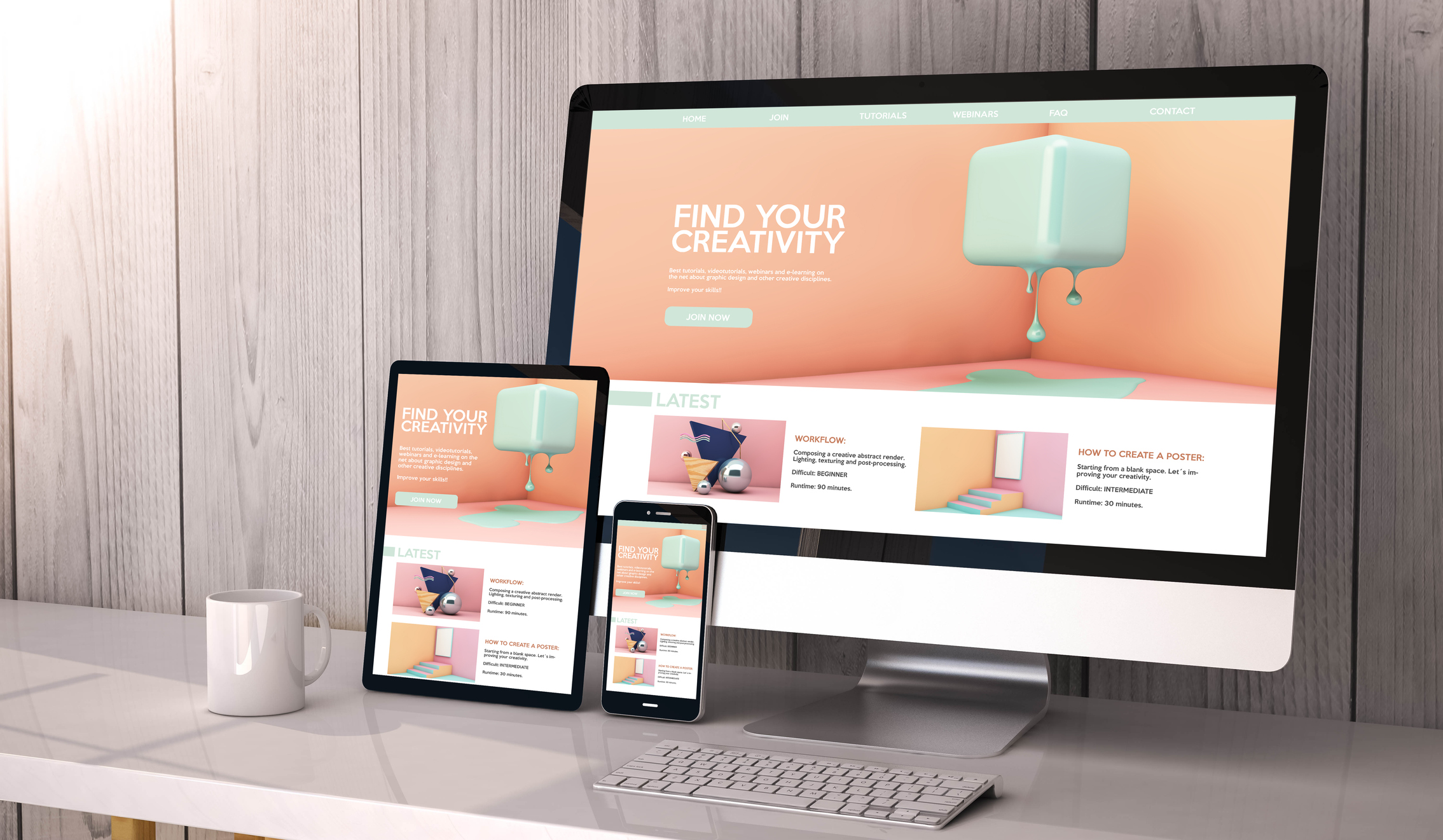
Visual hierarchy is one of the most important principles of good web design as it takes into consideration the way the human eye perceives what it sees. Certain parts of your website hold more importance than others and visual hierarchy helps them gain more attention. Content on your website and the layout of your pages follow a specific prominence. Headers welcome the user to the page and menus can be found at the top, bottom, or sides of a website. Website designers use visual hierarchy to organize the content of the page to present the highest priority content first. Visual hierarchy shows relationships where they exist between content blocks and organizes your content from most to least important.
Visual Hierarchy in Web Design
Websites need to be updated and maintained regularly in order to keep up with the latest trends in design and user experience, as well as to reflect changes in your properties. This doesn’t always involve an extreme overhaul and redesign – refreshing your website every six months to a year helps keep your content fresh and your users engaged.
- Size – Bigger may be more noticeable, but it may not always be better. While the most important elements should be the biggest, visual hierarchy design relies on subtlety and harmony between elements. Bigger elements draw more attention and can circumvent the traditional rules of left-to-right and up-to-down reading. Size can emphasize the message and content by making it more significant. Headings, for example, should stay between 18 and 29 pixels with body copy at 14 pixels, according to a study by Smashing Magazine. It’s important to maintain a sense of proportion throughout the design on your website.
- Color – In designing for the human eye, each color conveys its own psychological connections. Colors themselves have an inherent hierarchy with blacks and reds readily drawing attention compared to softer shades of yellow, cream, and grey. The effects of these colors can be enhanced and reversed by contrasting them against their natural opposite for greater attention to both. Consider contrasting colors to impact the visual hierarchy of your calls to action, as they may provide greater results.
- Layout – The layout of your website directly affects its visual hierarchy. Content appearing front and center on the pages calls for the most attention, but actionable items should be kept in their prime locations. Scrolling up and down may change the content, but the site logo, menu, contact information, and social media icons stay put. Rows and columns help organize the structure of your website and create spaces for CTAs and high-priority content. Predicting where the user’s eye will go helps you find hot spots for interaction.
- Spacing – The best designers embrace white space as a design tool rather than a blank canvas. The fewer elements you have, the more vibrant are the ones that remain. Creating the right amount of space between your most important elements helps keep them at the center of attention. Adding white space between paragraphs and in margins helps improve comprehension.
- Texture and Style – Choosing design elements that complement your brand’s personal style affects your visual hierarchy. Your branding style may include custom graphics, textures, the type of imagery (illustrative versus photography, matte vs glossy images). Texture adds depth and atmosphere to a website and offers similar advantages to size and color. For example, updating your website to include a textured background can make non-textured objects in the foreground stand out.
Keep Your Website Up-to-Date
Visual hierarchy helps visitors to your website easily make sense of the design and prioritizes what they want and what we want them to do. Your website should appeal to the way users process visual information and how they perceive element in the order a designer has emphasized. Updating your website to include contrasting colors, graphic styles and textures, bigger sizes for higher priority content, and using white space to your advantage can lead to an improved overall experience for your users.
Does your website visually prioritize the most important elements? Schedule a strategy session and website audit with G5 Studio and learn how you can convert more visitors using visual hierarchy in your design.
Get News, Articles & Updates in Your Inbox
Thank You for Your Interest
We will be in contact soon and look forward to learning more about you and your company. Based on your marketing challenges, we’ll discuss increasing visibility into your analytics and how to generate more and better leads so you can achieve your marketing goals.
In the meantime, we invite you to check out our checklist on website accessibility. Use this checklist to start assessing the baseline accessibility of your website.
Enjoy! We’ll be in touch very soon.