What is Data-Driven Design?
 Posted October 15, 2019 by G5
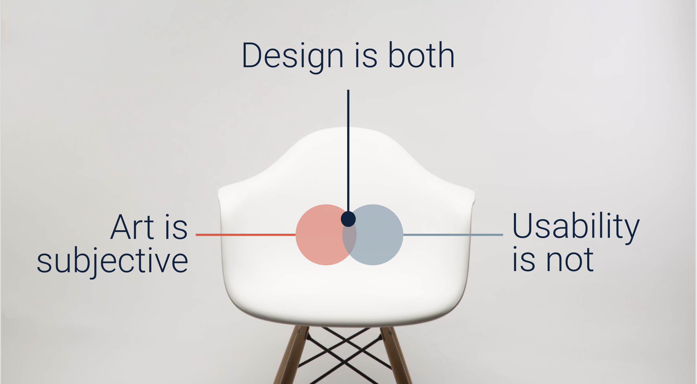
If you’ve been following G5 long, you’ve probably heard us talk about the importance of “data-driven design,” but what does that phrase actually mean? For us, it means that all our website designs are informed by data. We do this to ensure a strong user experience and frictionless path to conversion. While many websites lean on the visual appeal of a website – which relies heavily on personal opinion and doesn’t take into consideration engagement or usability – we focus on data-driven analysis, observational analysis, and industry-approved best practices to deliver high-performing designs.
Design for Performance
Data-driven design takes both qualitative and quantitative data into consideration when developing a website. Good design involves more than aesthetics, which is where data insights come in. Your audience may include different demographics based on your product or service and they each have their own way of looking at and interacting with a website. Having first-hand knowledge about the way your audience interacts with or interprets color, copy, font, calls-to-action (CTAs), and navigation all make an impact on the engagement and success of your website.
Data-Driven Design Best Practices
At G5, we developed our designs by tracking mouse-flow movements and monitoring how users navigate through websites. Integrating user insights and heat-mapping into the design process improves overall user experience which leads to greater on-page conversions.
Here are the elements you need to consider when designing your own data-driven website.
Calls to Action (CTAs)
CTAs prompt an immediate response from users. On websites, CTAs are buttons or short forms used to capture lead information or direct users to a page where they are most likely to convert. Data-driven design helps determine the right color, placement, and text on CTAs to provide a logical path that addresses user questions and motivates them to convert. Incorporating other elements on the page like your value proposition or reviews as psychological triggers help motivate conversion. For example, pairing a CTA to schedule a tour with a photo of the property helps inform the user and tells a more compelling story.
Navigation
Designers analyze insights to guide users along the simplest path to conversion. Horizontal menus are standard and often fixed to the top of the screen when scrolling. Toggle menus are great because they guide users with prominent CTAs and fewer distractions. Some themes use vertical menus aligned to the left. Data shows that most impressions and interactions occur above the fold and navigation should be visible on the first load of a website. The order and number of options on the menu have a major impact on both SEO and user experience. In particular, each page needs to be named simply to guide users where they want to go, quickly.
Each Color Plays a Role
Color makes a big difference in data-driven design. A website’s color palette helps make it unique while also reinforcing the branding and maintaining visual hierarchy. Each color – neutrals included – plays a role in the design of the site. The primary color leads and can be found in headers, color blocks, large numerals, and dominant graphics. The secondary color supports and can be found in subheaders, color blocks, and secondary body copy. The tertiary color demands attention and is used in small aesthetic elements like CTAs.
Colors help priority items contrast and pop on the page to draw attention. Use color to differentiate your brand from similar or generic websites. Branding helps websites look unique. Elements in imagery should mimic the brand colors and they should have a consistent look across the website.
Learn More About Data-Driven Design
There’s more to website design than how it looks; how it functions is just as important. For more information on G5’s data-driven design process, schedule a demo with our team today.
Get News, Articles & Updates in Your Inbox
Thank You for Your Interest
We will be in contact soon and look forward to learning more about you and your company. Based on your marketing challenges, we’ll discuss increasing visibility into your analytics and how to generate more and better leads so you can achieve your marketing goals.
In the meantime, we invite you to check out our checklist on website accessibility. Use this checklist to start assessing the baseline accessibility of your website.
Enjoy! We’ll be in touch very soon.